User guide
CircHiC tutorial
Introduction
CircHiC is a plotting library developped for bacterial Hi-C data. It is built upon Matplotlib, the single most used Python package for 2D-graphics.
This tutorial is heavily inspired by the excellent Matplotlib tutorial written by Nicolas Rougier.
A simple CircHic plot
In this section, we are going to plot data from E. coli from Lioy et al.
(2018) Cell, 172(4), 771–783.
The data is provided as a sample dataset of circhic. We will start with the
default setting and enrich the figure step by step to make it nicer and
supplement the Hi-C contact map with genomic information.
The first step is to load the data and the modules we will be using:
import matplotlib.pyplot as plt
import circhic

data = circhic.datasets.load_ecoli()
counts = data["counts"]
nbins = data["nbins"]
Several datasets are included in circhic, including contact maps from E.
coli, B. subtilis, a chromosome from the Human cell line KBM7, etc. All of
those datasets are accessible from the module circhic.datasets.
counts is a NumPy ndarray of shape (469, 469).
Before attempting any visualization, we will normalize the data using iced.
from iced.normalization import ICE_normalization
counts = ICE_normalization(counts)
Using the defaults
circhic comes with a set of default settings that are built upons
Matplotlib. These settings allow to customize almost any kind of properties:
figure size and dpi, line width, color and style, axes, axis and grid
properties, text and font properties and so on. While matplotlib defaults are
rather good in most cases, you may want to modify some properties for specific
cases.
circhic also requires to know more about the data plotted than
Matplotlib. In particular, the library requires to know the number of bins of
the Hi-C contact map. Let us instantiate a circhic figure by providing
the number of bins per chromosomes to the figure. You can also provide the
exact length in base pair.
(Source code, png, hires.png, pdf)

counts = data["counts"]
nbins = data["nbins"]

# Now instantiate the circhic Figure
circhicfig = circhic.CircHiCFigure(lengths=nbins)
circhicfig.plot_hic(counts)
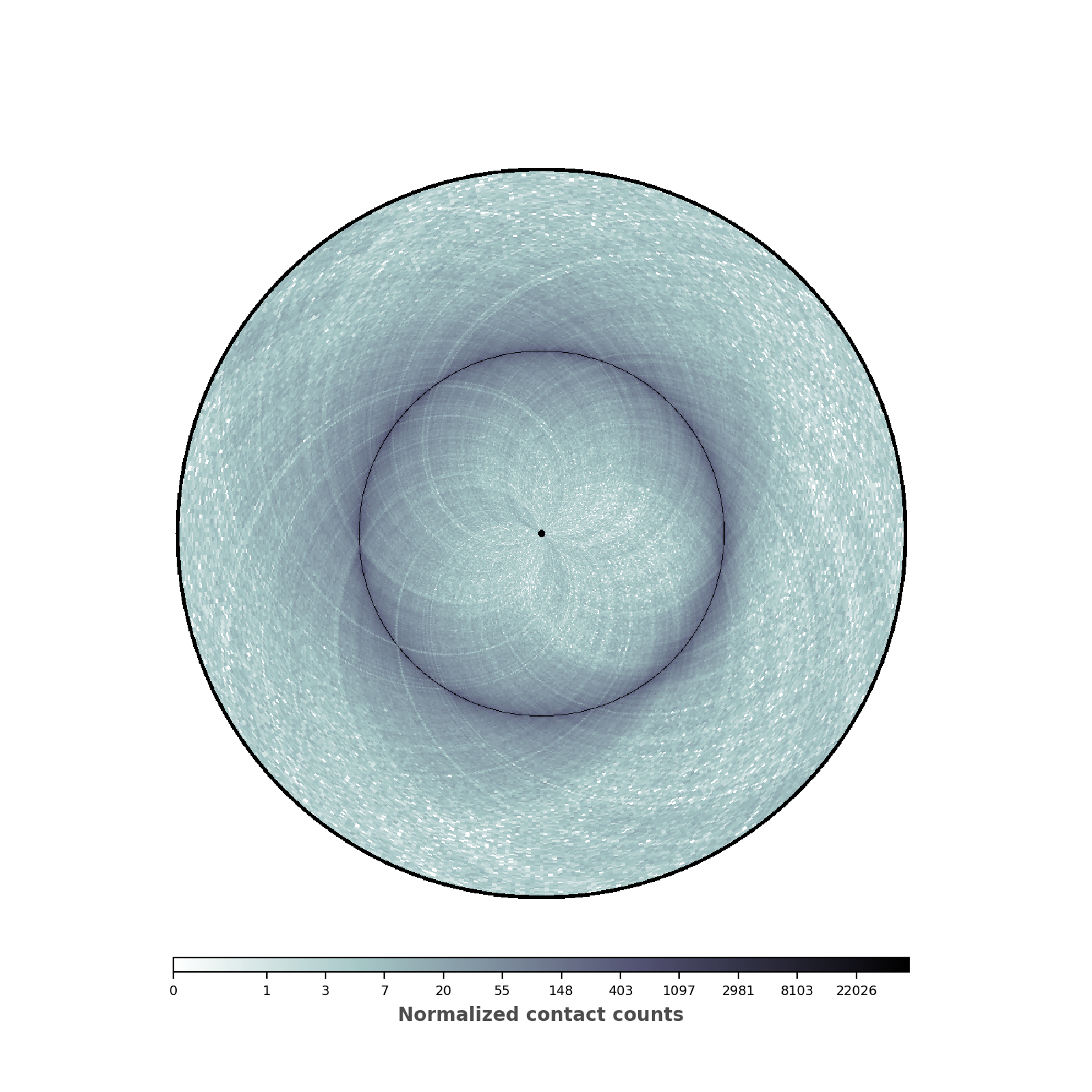
Changing colormap and border width
In the script below, we have changed the default colormap used as well as the border thickness.
(Source code, png, hires.png, pdf)
nbins = data["nbins"]

# Now instantiate the circhic Figure
circhicfig = circhic.CircHiCFigure(lengths=nbins)
circhicfig.plot_hic(counts, cmap="bone_r", border_thickness=0.01)
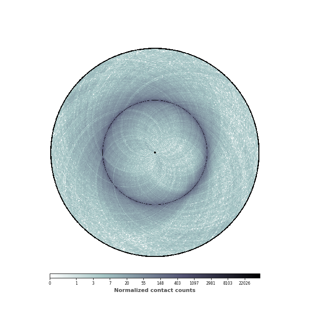
Adding a colorbar
We are now going to add a colorbar to the plot. In order to do this, we need
to retrieve the mappable, ie the image, that sets the range of values. The
colorbar can either be horizontal or vertical (the default).
(Source code, png, hires.png, pdf)
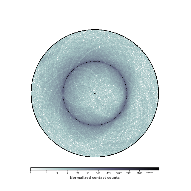
nbins = data["nbins"]

# Now instantiate the circhic Figure
circhicfig = circhic.CircHiCFigure(lengths=nbins)
im, ax = circhicfig.plot_hic(counts, cmap="bone_r", border_thickness=0.01)

# Add the colorbar as a vertical colorbar
cab = circhicfig.set_colorbar(im, orientation="horizontal")
cab.set_label("Normalized contact counts", fontweight="bold", color="0.3")
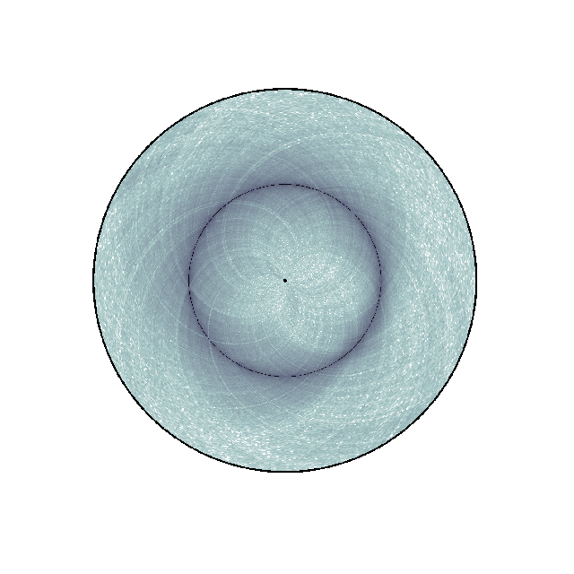
Changing the range of the colormap
We are now going to set the minimal and maximum value of the colorbar, in order to highlight the patterns of the contact map.
(Source code, png, hires.png, pdf)
data = circhic.datasets.load_ecoli()
counts = data["counts"]
nbins = data["nbins"]

# Normalize the data using ICE, and keep the biases
counts, bias = ICE_normalization(counts, output_bias=True)

# Now instantiate the circhic Figure
circhicfig = circhic.CircHiCFigure(lengths=nbins)

# Compute the extreme values
vmax = np.max([counts[i, (i+1) % counts.shape[0]]
               for i in range(counts.shape[0])])
vmin = np.min(counts[counts > 0]) * 10

im, ax = circhicfig.plot_hic(counts, cmap="bone_r", border_thickness=0.01,
                             vmin=vmin, vmax=vmax)

# Add the colorbar as a vertical colorbar
cab = circhicfig.set_colorbar(im, orientation="horizontal")
cab.set_label("Normalized contact counts", fontweight="bold", color="0.3")
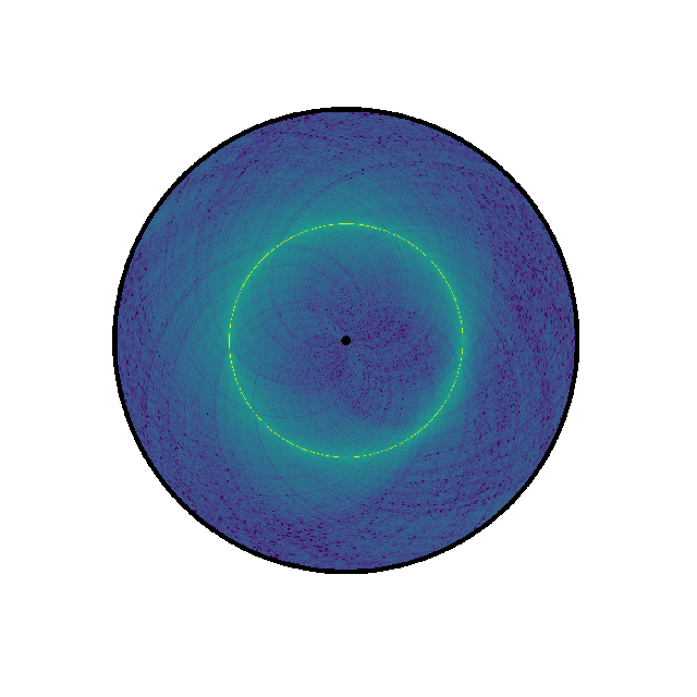
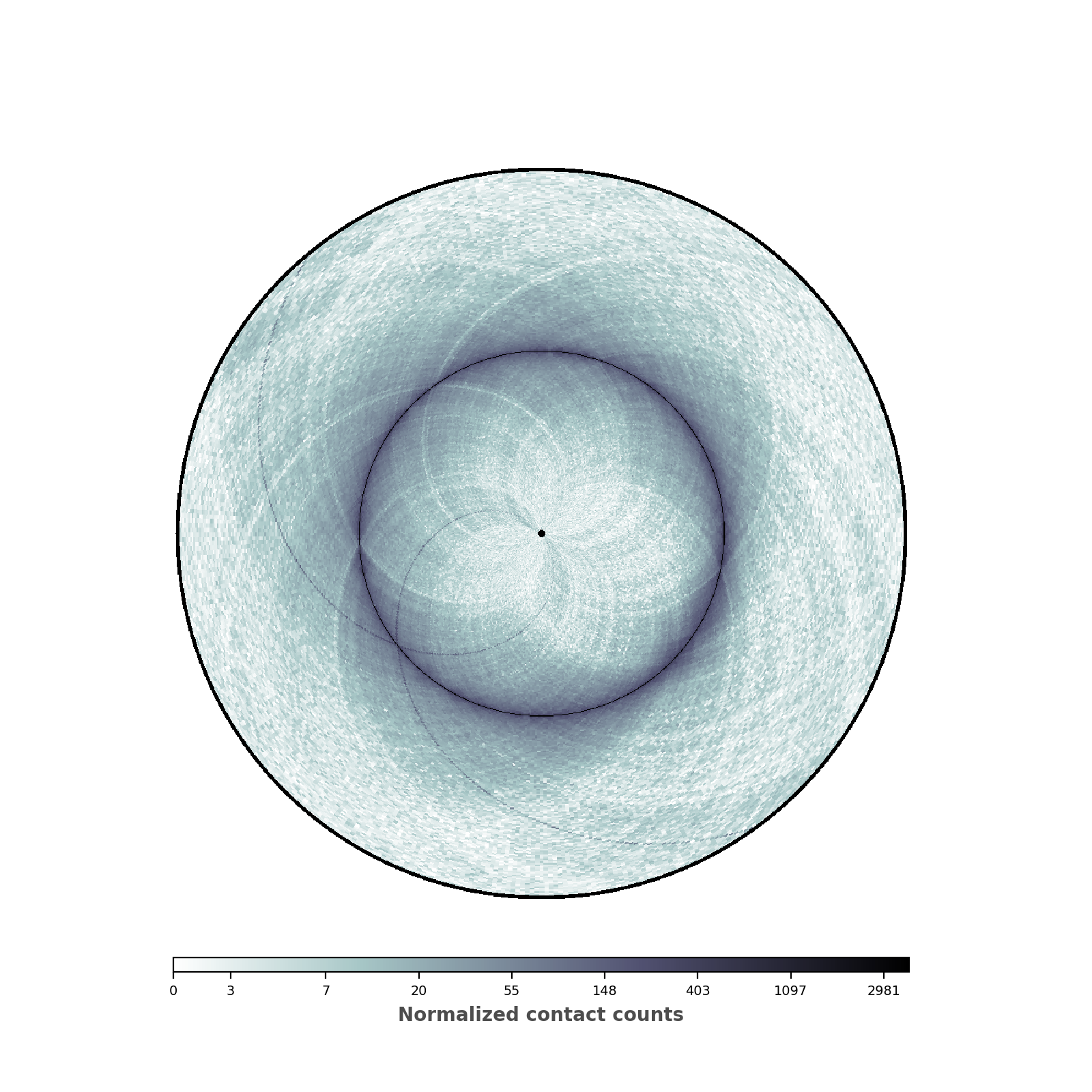
Setting the range of genomic distances plotted
In this figure, we would like to highlight two elements: (1) the chromosomal interaction domains (CID) (closely related to the topological associated domains in mammifers); (2) the second diagonal highlighting the enriched interactions between the two arms of the chromosome. We are thus going to adjust the range of the genomic distance plotted. To highlight the chromosomal interaction domains, we will plot only the contact counts close to the diagonal. To highlight the second diagonal, we will plot the whole range of contact count data. To facilitate readability, we will also set the inner radius to a non-zero value, in order to create a “donut” shape.
(Source code, png, hires.png, pdf)
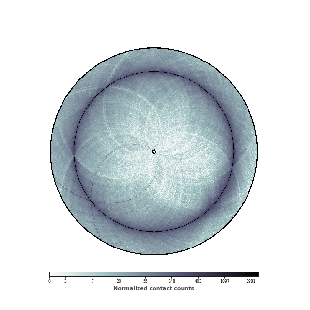
inner_gdis = 200
outer_gdis = 60
inner_radius = 0.01

im, ax = circhicfig.plot_hic(counts, cmap="bone_r", border_thickness=0.01,
                             vmin=vmin, vmax=vmax, inner_radius=inner_radius,
                             inner_gdis=inner_gdis, outer_gdis=outer_gdis)
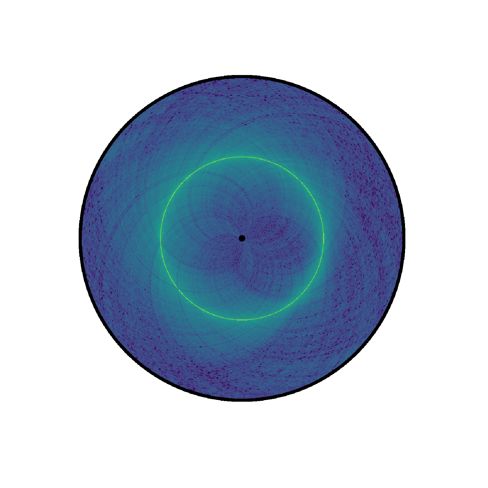
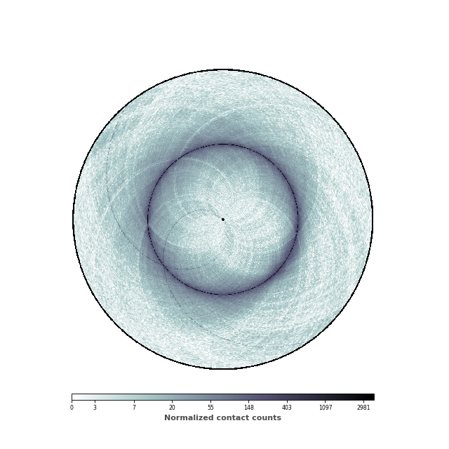
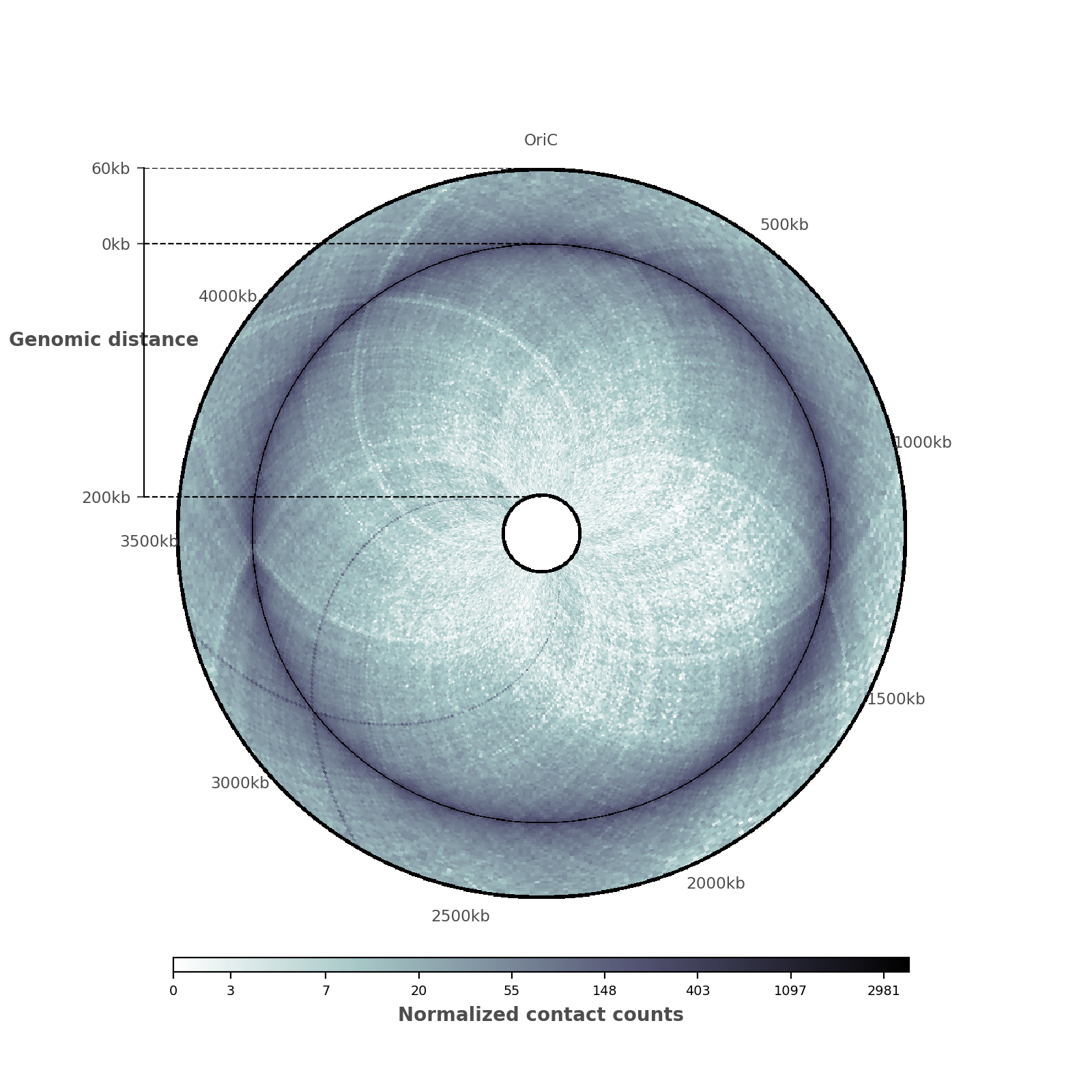
Adding ticks and tick labels
Now that the contact map displays the two features we are interested in, it is time to add ticks and tick labels to the plot.
(Source code, png, hires.png, pdf)
And here is the entire code to reproduce this plot!
import circhic
import numpy as np

from iced.normalization import ICE_normalization


# Start by loading the data
data = circhic.datasets.load_ecoli()
counts = data["counts"]
nbins = data["nbins"]

# Normalize the data using ICE, and keep the biases
counts, bias = ICE_normalization(counts, output_bias=True)


# Now instantiate the circhic Figure
circhicfig = circhic.CircHiCFigure(lengths=nbins)

# Compute the extreme values
vmax = np.max([counts[i, (i+1) % counts.shape[0]]
               for i in range(counts.shape[0])])
vmin = np.min(counts[counts > 0]) * 10

# define the inner genomid distances and the outer genomic distance plotted
inner_radius = 0.1
inner_gdis, outer_gdis = 200, 60

im, ax = circhicfig.plot_hic(counts, cmap="bone_r", border_thickness=0.01,
                             vmin=vmin, vmax=vmax, inner_radius=inner_radius,
                             inner_gdis=inner_gdis, outer_gdis=outer_gdis)

# Add the colorbar as a vertical colorbar
cab = circhicfig.set_colorbar(im, orientation="horizontal")
cab.set_label("Normalized contact counts", fontweight="bold", color="0.3")

# Now, let us add the ticks and tick labels
ticklabels = ["%dkb" % (i * 500) for i in range(9)]
tickpositions = [int(i*50) for i in range(9)]
ticklabels[0] = "OriC"
ax = circhicfig.set_genomic_ticklabels(
    tickpositions=tickpositions,
    ticklabels=ticklabels,
    outer_radius=1, fontdict={'fontsize': "small"})
ax.tick_params(colors="0.3")

rax = circhicfig.plot_raxis()
rax.set_yticklabels(["200kb", "0kb", "60kb"], fontsize="small")

rax.set_ylabel("Genomic distance", color="0.3",
               fontweight="bold")
rax.tick_params(colors="0.3")