Note
Go to the end to download the full example code. or to run this example in your browser via Binder
Plotting bands
Here’s a small example showcasing how to plot circular bands indicating categorical data.
import numpy as np
from circhic._base import CircHiCFigure
First, simulate some data
lengths = np.array([3500])
random_state = np.random.RandomState(42)
simulated_bands = random_state.randint(0, lengths.sum(), 100)
simulated_bands.sort()
simulated_bands = simulated_bands.reshape(-1, 2)
labels = np.random.randint(0, 3, simulated_bands.shape[0])
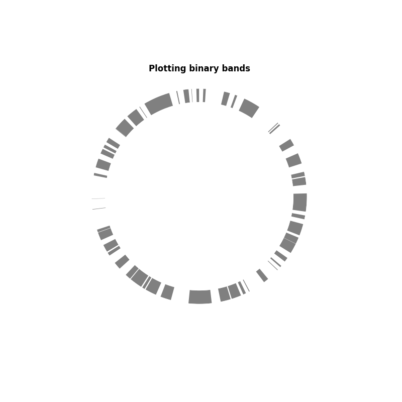
In this first example, we are just going to plot a binary band: in or out of the category. It can be useful to indicate the presence of a gene or a geneset, or open/close chromatine.
circhicfig = CircHiCFigure(lengths)
_, ax = circhicfig.plot_bands(
    simulated_bands[:, 0],
    simulated_bands[:, 1],
    colors=np.repeat("0.5", simulated_bands.shape[0]),
    inner_radius=0.7, outer_radius=0.8)
ax.set_title("Plotting binary bands", fontweight="bold")
Text(0.5, 1.0617147722273774, 'Plotting binary bands')
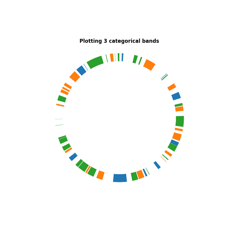
In this second example, we are going to provide specific category. To do this, we create a vector of colors representing the labels
colors = np.asarray(["C%d" % d for d in labels])
circhicfig = CircHiCFigure(lengths)
_, ax = circhicfig.plot_bands(
    simulated_bands[:, 0],
    simulated_bands[:, 1],
    colors=colors,
    inner_radius=0.7, outer_radius=0.8)
ax.set_title("Plotting 3 categorical bands", fontweight="bold")
Text(0.5, 1.0617147722273774, 'Plotting 3 categorical bands')
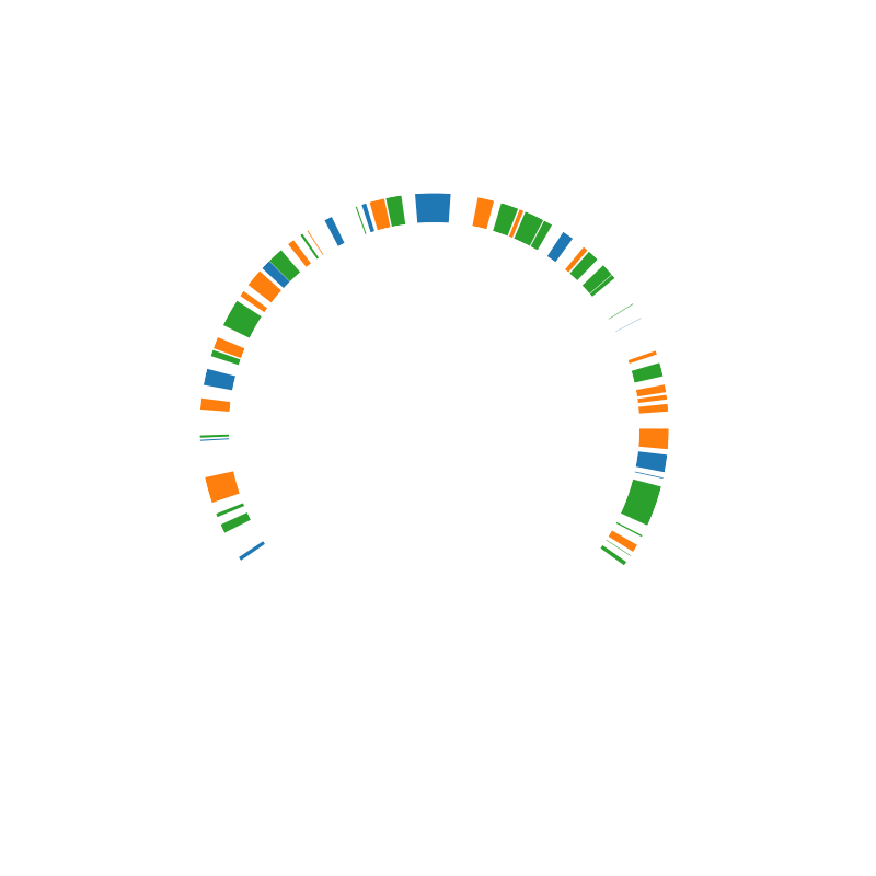
Here, we do the same but for a linear chromosome
circhicfig = CircHiCFigure(lengths, chromosome_type="linear")
_, ax = circhicfig.plot_bands(
    simulated_bands[:, 0],
    simulated_bands[:, 1],
    colors=colors,
    inner_radius=0.7, outer_radius=0.8)
Total running time of the script: (0 minutes 0.395 seconds)